 ResBuilder: Defining Control Properties via the Properties Page (Superseded)
ResBuilder has been superseded by the FormBuilder module in the BASIS IDE for BBj. ResBuilder is no longer included in the BBj download package as of version 12.0 but can be downloaded with Visual PRO/5.
Each time you create a control in ResBuilder, you also create a property page that allows you to define the control properties. To display property pages and enter property definitions, do the following:
-
Click the control, then do one of the following:
-
On the Main toolbar, click Properties.
-
On the tree view, right-click the control's icon to display the context-sensitive menu, then click Properties.
-
On the tree view, double-click the control's icon.
-
-
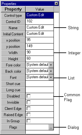
The control's properties page then appears. Properties pages are used to set properties for the selected item and are organized into five property types, as identified below. Each property type is described under Property Types.
Properties descriptions are contained in the Resource Properties Index.
-
In the Value column of the properties page, define the control properties, as follows:
-
To define string properties, enter a text string. In all controls except tab, grid, INPUTN and INPUTE, Visual PRO/5 interprets \t and \n in text property entries as a tab and a new line, respectively. To insert a backslash character, use \\.
-
To define integer properties, enter a numeric value.
-
To define list properties, click the list button, and click the desired property.
-
To define common flag options, click the check box to insert a check mark.
-
To define dialog properties, click the ellipsis button (...) to display the appropriate Windows dialog.
-
-
For tab controls, the Tab Number box identifies the tab to be defined in the following box, Tab Number.
-
To display help for properties page entries, click anywhere within the Value column and press F1. Click the link pertaining to the control type to display property descriptions. The descriptions can also be displayed by clicking the following:
Property Types
The properties page entries fall into the following types:
String Properties
String properties use text entries to define settings such as Name, Initial Contents, Short Cue, and Long Cue.
Integer Properties
Integer properties use integer entries to define settings such as Control ID, X position, Y position, Height, and Width.
List Properties
List properties define settings such as Justification, Fore Color, and Back Color that are selected via list box selections. A list property field can be identified by the drop-down button that is positioned along its right edge. Some of these properties allow you to choose between the windows system defaults and customized settings defined via common Windows dialogs such as color palettes and font lists.
Common Flag Properties
Common Flag properties use check boxes to define flags that are common to many types of controls, such as Client Edge, Raised Edge, Invisible, and Disabled.
Dialog Properties
Dialog properties define settings such as flags that are established via common Windows dialogs. A dialog property field can be identified by the ellipsis (...) button that is positioned along its right edge.
Control Property Dialogs
Custom Edit Flags
|
Flag |
Description |
|---|---|
|
Border |
Draws a border around the control. |
|
Ignore tabs |
Causes the control to ignore tabs in text input. |
|
Word wrap |
Causes the control to wrap text to the next line. |
|
Horizontal scrollbar |
Creates a horizontal scroll bar. |
|
One paragraph |
Limits the control text to one paragraph. |
|
Overstrike mode |
Causes the control to be initially in overstrike mode. |
|
Read only |
Defines the edit text as read-only. |
|
Vertical scrollbar |
Creates a vertical scroll bar. |
Tab Flags
|
Flag |
Description |
|---|---|
|
Auto management |
Sets the tab control to automatically manage events. |
|
Buttons |
Causes the tabs to appear as buttons. |
|
Fixed width |
Sets fixed tab widths. |
|
Focus never |
Prevents the tab control from receiving focus when clicked. |
|
Focus on button down |
Causes the tab control to receive focus when clicked. |
|
Force icon left |
Forces icons to the left margin of the tab control. |
|
Multiple lines |
Displays all rows of tabs. |
|
Ragged right |
Prevents tabs from filling the entire width of the tab control. |
|
Right-justify |
Expands each tab, causing the row to fill the entire width of the tab control. |
|
Single line |
Displays all tab text on a single line. |
Tab Properties
|
Property |
Description |
|---|---|
|
Tab number |
Specifies the tab for which the following properties are to be set. |
|
Image list index |
Specifies the image list index for the selected tab. |
|
Title |
Specifies the text to appear on the tab. |
|
Automanaged control ID |
Specifies the ID of a control or child window to be displayed when the tab is selected by the user. The default value of –1 indicates that no control or child window should be displayed automatically. |
Grid Column Properties
|
Property |
Description |
|---|---|
|
Column number |
Specifies the column for which the following two properties are to be set |
|
Column width |
Specifies the width of the column. |
|
Column title |
Specifies the column title. |