CSS Layout Options for Responsive DWC Apps
Overview
DWC applications can use CSS layout features to arrange and resize controls responsively as the available browser space changes. CSS Flexbox provides one-dimensional layout along a row or column, while CSS Grid provides two-dimensional control over rows and columns. These techniques can be combined with responsive CSS features such as media queries and flexible sizing to adapt an application to different viewport sizes.
This page describes how to select and configure CSS layout options for DWC applications, including Flexbox, Grid, responsive grid templates, alignment, and sizing techniques. For information about enabling automatic layout before applying CSS layout rules, see: DWC FAQ.
Choosing a CSS Layout Strategy
WC applications can use different CSS layout techniques depending on how controls need to be arranged and how the layout should respond to available space.
CSS Flexbox is well suited to one-dimensional layouts where controls are primarily arranged in a row or column. It provides control over spacing, alignment, wrapping, ordering, and how items grow or shrink within the available space.
CSS Grid is better suited to two-dimensional layouts that require coordinated rows and columns. Controls can be positioned by grid lines or named areas and can span multiple rows or columns, making Grid useful for more structured application layouts.
CSS media queries can be combined with Flexbox or Grid to apply different layout rules according to conditions such as viewport width, height, or orientation. This allows a DWC application to adapt its layout for different screen sizes without requiring BBj resize callbacks.
CSS Flexbox
CSS Flexbox is useful when DWC controls need to be arranged primarily along a single axis, either horizontally or vertically. Apply Flexbox container properties to a window's content panel with BBjWindow::setPanelStyle(). Properties that affect an individual flex item can be applied directly to the control with BBjControl::setStyle().
Common Flexbox properties include:
-
flex-wrapcontrols whether items remain on one line or wrap when the available space becomes limited. Supported behaviors include nowrap, wrap, and wrap-reverse. -
flex-directiondefines the main layout direction using row, row-reverse, column, or column-reverse. The flex-flow shorthand combines flex-direction and flex-wrap. -
justify-contentcontrols spacing and alignment along the main axis. -
align-itemscontrols how items are aligned along the cross axis. -
gapdefines spacing between flex items without requiring margins on individual controls. -
orderchanges the visual position of an item within the flex container. -
flex-growandflex-shrinkcontrol how individual items expand into available space or shrink when space is limited. -
align-selfallows an individual item to override the container's default cross-axis alignment.
These properties can be combined to create DWC layouts that adjust automatically as the available window or browser space changes.
Testing CSS Flexbox Layouts
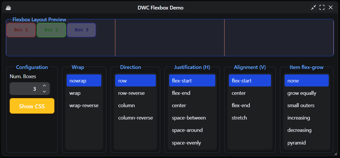
The DWCFlexbox.bbj sample lets you experiment with common CSS Flexbox properties in a DWC window. Run the program in DWC, then change the values for Wrap, Direction, Justification, Alignment, and Item flex-grow to see how they affect the layout of the preview boxes.
The following image shows the tested sample running in DWC with 3 boxes, nowrap, row, flex-start justification, flex-start alignment, and none selected for item flex-grow.
After selecting a layout configuration, click Show CSS to display the current CSS properties applied to the Flexbox Layout Preview child window along with the corresponding BBj code.
The following image shows the Layout Information dialog for the tested configuration. The dialog reports display: flex, flex-flow: row, align-items: flex-start, and justify-content: flex-start, and it shows the corresponding setPanelStyle() calls for applying the same layout priorities to a top-level BBj window.
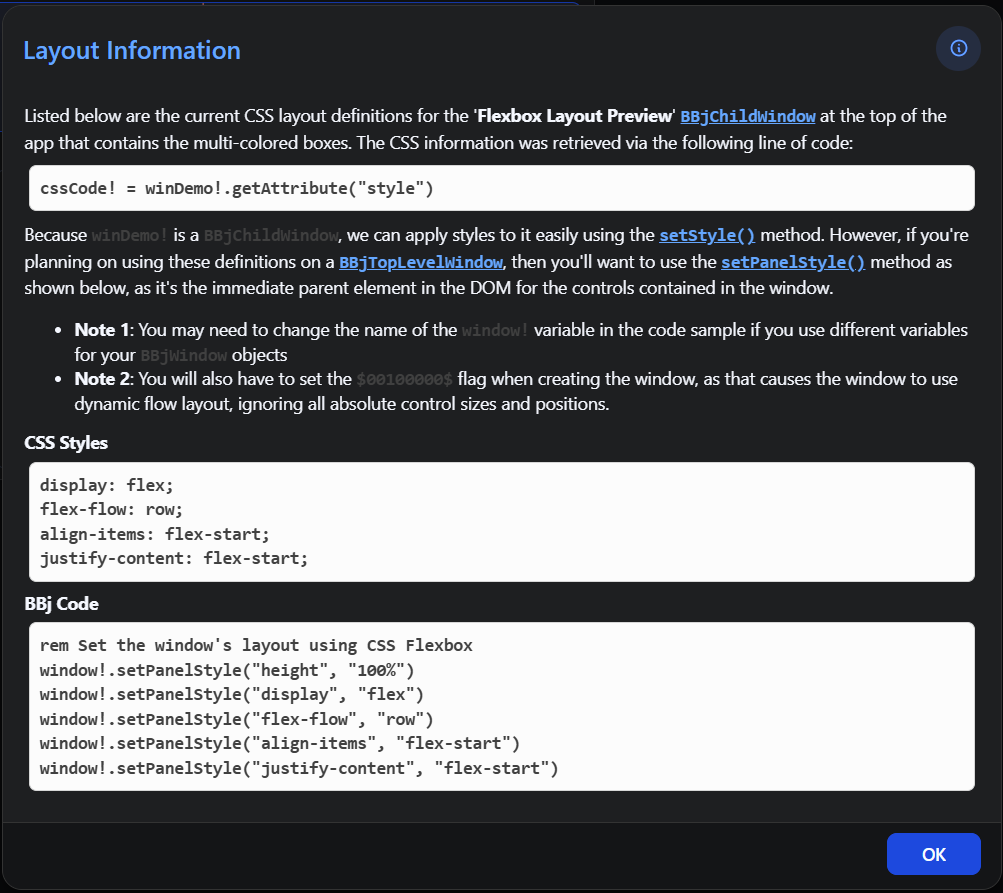
The Flexbox preview uses a BBjChildWindow, where layout properties can be applied with setStyle(). For a BBjTopLevelWindow, apply the corresponding CSS properties to the window's content panel with BBjWindow::setPanelStyle().
CSS Grid
CSS Grid provides a two-dimensional layout system for arranging DWC controls in rows and columns. It is useful when a layout requires coordinated horizontal and vertical positioning, such as forms with multiple columns, controls that span multiple tracks, or structured application regions.
Grid layouts support properties for defining rows, columns, spacing, alignment, and item placement. For a detailed reference to CSS Grid properties and values, see: CSS-Tricks Complete Guide to Grid.
Placing Controls in a CSS Grid
Controls can be positioned in a CSS Grid by defining grid tracks and assigning items to specific rows, columns, or named grid areas. Named areas provide a readable way to describe the structure of a grid and control where individual items are placed.
The CSS Grid Playground provides an interactive example for experimenting with grid templates, rows, columns, gaps, and named areas.
The following image shows the Two Column template in CSS Grid Playground, where the layout defines header, sidebar, main, and footer grid areas.
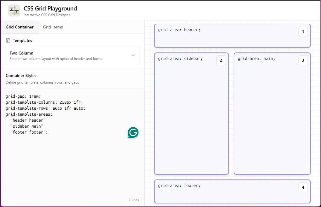
In this example, grid-template-areas defines the structure of the layout, while each grid item uses grid-area to identify the region it occupies.
Applying CSS Grid to a DWC Window
The DWC1.bbj sample demonstrates a simple CSS Grid layout in a DWC window. The window uses inline-grid and defines two columns with grid-template-columns: a fixed 180px column followed by an auto column that uses the available remaining space.
wnd!.setPanelStyle("display","inline-grid")
wnd!.setPanelStyle("grid-template-columns","180px auto")
The following image shows the tested DWC1.bbj sample with the browser Developer Tools Grid overlay enabled. The overlay identifies the grid tracks created by grid-template-columns: 180px auto and shows how the controls are positioned within the two-column layout.
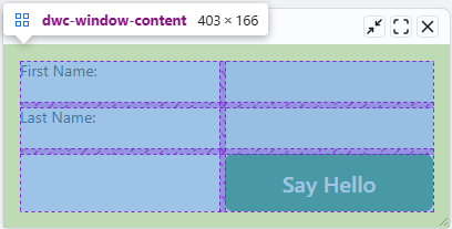
The first column uses a fixed width of 180px, while the second column uses auto to occupy the remaining available space. Additional controls flow into new rows while retaining the two-column grid structure.
More Template Options
CSS Grid templates can use repeat() and minmax() to create layouts that adapt the number and size of columns to the available space.
The repeat() function represents a repeated track pattern in a more compact form. For example, the following definitions create the same four-column pattern:
grid-template-columns: auto 1fr auto 1fr;
grid-template-columns: repeat(2, auto 1fr);
The repeat count can also use auto-fit or auto-fill, allowing CSS Grid to create as many repeated tracks as the available space can accommodate. For details, see: repeat().
The minmax() function defines a minimum and maximum size for a grid track. This allows a column to maintain a usable minimum size while expanding when additional space is available. For details, see: minmax().
The following example combines these functions to create a responsive two-column pattern:
display: grid;
grid-template-columns:
repeat(auto-fit, minmax(10ch, 1fr) minmax(20ch, 2fr));
Each repeated pattern contains two columns. The first has a minimum width of 10ch and can expand to 1fr, while the second has a minimum width of 20ch and can expand to 2fr. As the available width increases, auto-fit allows additional pairs of columns to fit within the grid container.
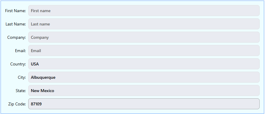
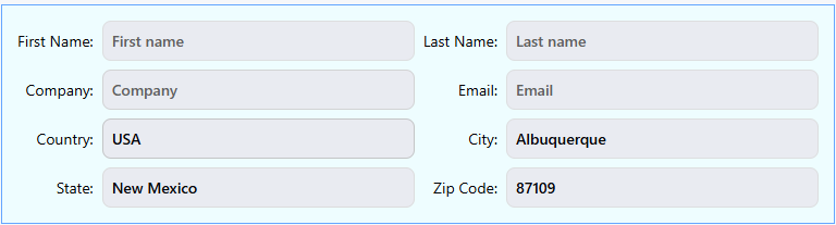
The DWCGrid.bbj sample demonstrates this responsive layout in DWC. Run the sample, select CSS Layout 9, and resize the window horizontally to observe how the same grid definition adapts to the available width.
The following images show the tested layout at progressively wider window sizes.
A narrow layout provides enough space for one label-and-input pair per row:
As additional width becomes available, another pair can fit within each row:
At a wider size, the same grid definition accommodates an additional pair while preserving the responsive layout:

Testing CSS Grid Layouts
The DWCGrid.bbj sample provides several CSS Grid configurations for comparing track sizing and responsive layout behavior in DWC. Run the sample in DWC and select a layout from the Select a CSS Layout list to apply it to the form. The CSS Preview displays the CSS definition used by the selected layout.
Layouts 1 through 4 demonstrate differences between auto, fractional (fr), and percentage-based track sizing. Layouts 5 and 6 use fixed four-column structures, which work well when sufficient horizontal space is available but can become constrained as the window narrows.
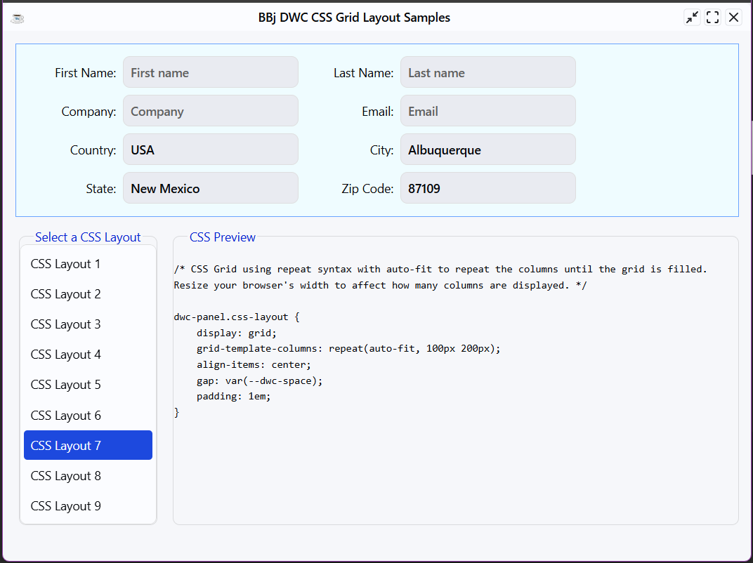
Layout 7 uses repeat() with auto-fit to add or remove fixed-size label-and-input column pairs according to the available width. The following image shows the tested sample with CSS Layout 7 selected.
Layout 8 demonstrates a breakpoint-based approach using CSS media queries. The base layout defines two columns, while media queries change the grid template as the viewport becomes wider, allowing the form to display four or six columns.
The following image shows the tested CSS Layout 8 configuration while the viewport width is being adjusted in the browser's responsive Developer Tools view.
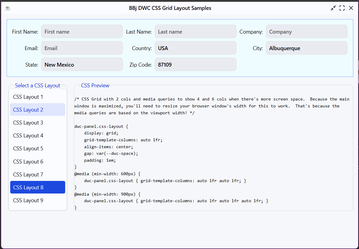
As the viewport crosses the defined breakpoints, the media-query rules replace the original column template, allowing the same DWC form to reorganize without BBj resize callbacks.
Layout 9 provides another responsive approach by combining repeat(), auto-fit, and minmax(). Unlike Layout 7's fixed track sizes, the minimum and maximum track definitions allow the label and input columns to grow and shrink with the available space. This behavior is described in More Template Options section above.
Grid Alignment
CSS Grid provides separate properties for aligning grid items and positioning the grid within its container. The justify-* properties operate along the inline axis, while the align-* properties operate along the block axis.
-
justify-itemsandalign-itemsset the default alignment for items within their grid areas. -
justify-contentandalign-contentposition the grid tracks within the container when additional space is available. -
justify-selfandalign-selfallow an individual grid item to override the corresponding default item alignment.
These properties can be combined to control both the overall grid and individual controls without changing the grid's row or column definitions.
Fractional Units
CSS Grid supports the fr unit for distributing available space among grid tracks. Unlike percentage-based tracks, which are calculated from the container size, fractional tracks divide the space remaining after fixed sizes, content, gaps, and other track requirements are accounted for.
For example:
grid-template-columns: 1fr 3fr;
The available space is divided into four fractional units, with the second column receiving three times the share of the first. This makes fr useful for flexible layouts that need to adapt as the grid container changes size.
For additional information and examples, see: CSS-Tricks: An Introduction to the fr CSS Unit.