Dashboard Chart Types
The Dashboard offers several different types of charts to choose from. Which type of chart you select depends on several factors, including the message or information you want to convey and the data that will be used and compared. Depending on the data, you may be limited to a certain set of charts. For example, pie charts are fairly simplistic, so when the data is multidimensional and you need to display it in discrete groups then a bar chart will be the best format since it supports more advanced datasets. In the cases where multiple chart types could be used to represent your data, the choice is up to you. The different chart types represent the data in unique ways, so using a particular chart type can emphasize a particular detail about the data. You choice depends on factors such as whether you are comparing amounts, analyzing a trend, dissecting components, identifying outliers and standouts, etc.
Following are examples of the charts that you can use with the Dashboard utility. Note that within each main category of charts, such as bar charts, you have flexibility and may modify several factors including the orientation, whether it is flat or three-dimensional, whether it displays a legend or not, the location of the legend box, and more.
Pie Charts
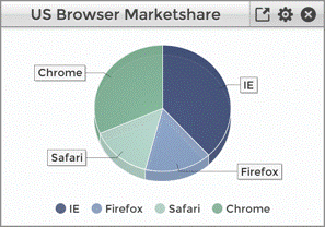
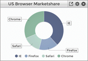
Pie charts are a popular choice for displaying a single series of data. It is commonly used to display data in a componentized format, such as displaying a breakdown of corporate expenses. All of the data is related, and the pie slices all add up to 100%. It therefore gives a clear idea of how much a particular piece of the pie compares to the rest of the components. Pie charts work well with Sequential or Categorical color themes (see Choosing the Right Color Theme For Your Chart for more information on color choices). Subclasses of the PieChartWidget include the RingChartWidget.
Bar Charts
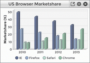
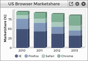
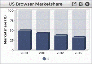
Bar charts are versatile, as you can work with grouped data and choose between displaying values in a discrete fashion along the domain axis, or stack the values. Bar charts work well when dealing with time series, frequency distributions, and correlations. However, due to the amount of space the individual bars require, they are better suited to series with a limited number of data points. When you have a large number of data points, or a lengthy time entries for example, a line or XY chart would be a better choice. Depending on the goal for the chart, bar charts work well with Sequential, Categorical, or Divergent color themes. If the data is related, just as yearly sales, a sequential color theme would work well. If the bars represent unrelated data, then a categorical color theme would be best. You may choose to use a darker or higher contrast color to emphasize a particular item in the chart. Vertical bar charts are better suited to time series, and Horizontal bar charts work better for item comparison and cases where the items have longer labels. When representing a time series, bar charts tend to emphasize levels of magnitude, whereas a line or XY chart emphasizes trends and rates of change. Subclasses of the BarChartWidget include the StackedBarChartWidget, and StackedPercentageBarChartWidget.
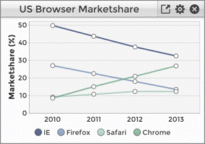
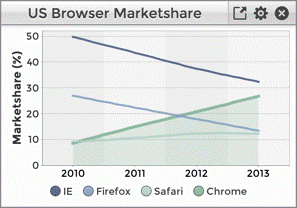
Line Charts
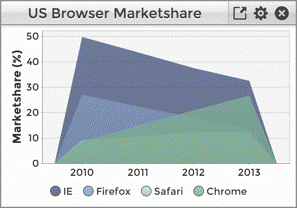
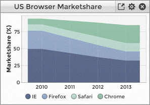
Line charts are also very versatile and are the most often used type of chart. The domain axis may be comprised of string values, such as months of the year (Jan, Feb, etc.) or numerical values. Line charts support multiple series, making it possible to compare the performance of two or more items. Line charts also have several variations, allowing flexibility in presentation by optionally filling in the area underneath the line, stacking the lines, smoothing the curves, specifying the shape of the data point, etc. Line charts work well with Categorical color themes, and are well suited for displaying time series and trends. Depending on the use case, you may want to set a gradient for the range rather than using a particular color theme (see Setting the Colors for the Chart’s Range for more information on setting the range colors. Subclasses of the LineChartWidget include the AreaChartWidget, StackedAreaChartWidget, and the XYChartWidget.
The table below lists the types of available chart widgets along with an example of each type of chart and the type of data comparison for which it is best suited.
|
Chart Type |
Example |
Data Comparison |
|
BarChart |
|
Items, time series, frequency, correlation |
|
StackedBarChart |
|
Items, time series, frequency, correlation |
|
StackedPercentageBarChart |
|
Items, time series, frequency, correlation, percentage |
|
PieChart |
|
comparison, componentization, percentage |
|
RingChart |
|
comparison, componentization, percentage |
|
LineChart |
|
comparison, time series, frequency, trends |
|
AreaChart |
|
comparison, time series, frequency, trends |
|
AreaChart |
|
comparison, time series, frequency, trends |
|
XYChart |
|
comparison, time series, frequency, trends |