 DWC Design Kit
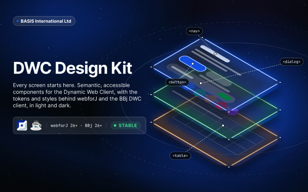
The official Figma kit for DWC gives designers the same semantic, accessible components applications ship with, drawn once and kept in step with the platform, so what you design is what your team can build.
Open the kit on Figma Community
What is inside
- Components. Every DWC component as a resizable master with variants for state, size and theme.
- Tokens as variables. Color, surfaces, spacing, radii and typography as Figma variables, with light and dark as modes.
- Styles. Text styles for the type scale, effect styles for shadows and focus rings, named the way the theme engine names them.
- Themes and sizes. Seven themes and five sizes on every component, applied through modes.
- Example applications. Real screens built only from the kit, in light and dark.
- Documentation. A page per component with anatomy, sizes, themes, states and do and don't examples.
Versions
This kit is used for BBj 26.00 and higher, for older versions of BBj, use the legacy DWC Design Kit.
Tokens in the kit and in CSS
Every variable in the kit maps to a CSS variable of the theme engine. Color steps follow the color palette, sizes follow sizing and spacing, and shadows and focus rings follow style. Switching the kit's mode from light to dark mirrors the dark theme in CSS.