DWC Controls with Extended Attributes
Overview
DWC controls are implemented as web components and can expose DWC-specific attributes and themes that provide functionality beyond the corresponding GUI and BUI controls. These options can affect a control’s appearance, behavior, layout, and interaction in a DWC application, including component themes, control-specific attributes, built-in BBjTree search capabilities, and input control labels. For control-specific attributes, styling options, and supported DWC features, see: DWC-specific control documentation.
Component Themes
Many DWC components support a theme attribute that applies a predefined semantic appearance to the control. Common component themes include default, primary, success, warning, danger, info, and gray. The supported theme values can vary by component. For control-specific attributes, themes and other DWC options, see : DWC Component Documentation . To apply a supported theme to a BBj control, see: BBjControl::setAttribute(). For example:
button!.setAttribute("theme","success")
The theme attribute changes the control's appearance by using the corresponding DWC color palette without requiring application-specific CSS. For the DWC component theme system and available semantic theme values, see: webforJ Component Themes.
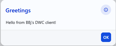
The MessageBox.bbj sample demonstrates how a DWC component theme can be applied to a BBj message box. The program identifies the current client and passes theme=primary through the MSGBOX() MODE argument:
|
The following screenshot shows the tested MessageBox.bbj sample running in DWC with the primary component theme applied.
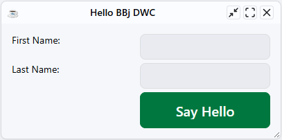
The DWC1.bbj sample demonstrates applying the success component theme to a DWC button. The button uses the DWC theme attribute so its appearance reflects the predefined success palette.
|
The following screenshot shows the tested DWC1.bbj sample running in DWC with the Say Hello button using the success theme.
DWC Control Attributes
DWC controls can expose component-specific attributes that extend their appearance and behavior beyond the corresponding GUI and BUI controls. In BBj, these attributes can be applied with BBjControl::setAttribute(). The available attributes vary by component; for the attributes supported by a specific control, see: DWC Component Documentation.
BBjTree Search Attributes
BBjTree supports DWC attributes that provide client-side search and filtering. The search-input attribute displays a search field for filtering tree items, while search-case-sensitive controls whether matching is case-sensitive. The search-placeholder and search-nodata attributes customize the search field placeholder and the message displayed when no results are found. The search-term attribute can be used to filter the tree programmatically and supports regular expressions.
Using BBjTree Search Attributes
The TreeSearch.bbj sample demonstrates DWC-specific BBjTree attributes, including client-side search and filtering. The sample provides controls for enabling or disabling tree attributes and includes individual search fields for each tree and a global search field for filtering both trees. For the DWC-specific attributes, see: BBjTree.
The following screenshot shows the tested TreeSearch.bbj sample running in DWC with the tree attribute controls, global search field, individual tree search fields, and two BBjTree controls.
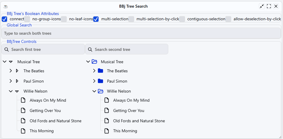
The Boolean attribute controls at the top of the window allow supported tree behaviors to be enabled or disabled at runtime, while the search fields demonstrate the DWC tree search functionality described above.
Input Control Labels
DWC input controls can use the label attribute to create a label that is visually and programmatically associated with the control. Built-in labels can reduce the need for separate BBjStaticText controls and improve accessibility and responsive layout behavior. For usage, examples, advantages, and best practices, see: DWC: Labels.
Using Built-In Label Attributes
The LabelAttributes.bbj sample compares built-in label attributes with separate BBjStaticText controls. When label attributes are enabled, each input control displays its own associated label.
The following screenshot shows the tested sample running in DWC with built-in labels for the Name, Company, and Email input controls.

For detailed information about built-in control labels and their advantages, see: DWC: Labels.