Dashboard Charts and Datasets
The datasets used by each type of chart varies, and you control the way
the data is represented in the chart by how you add the data to the dataset.
This section covers the concepts and dataset formats used by the chart
widgets in the Dashboard.
An Overview of Charts and Data
When you create a chart widget, you can choose from multiple constructors. One constructor requires a database connection and SQL query string, and the other does not deal with data at all. If the connection and query string are provided, the chart is populated with the result of the query automatically - no further code is necessary. As long as the SQL query returns a result set that conforms to the required dataset format then everything is taken care of by the Dashboard. Additionally, if a chart is populated from an SQL query, it will automatically be configured to be refreshable. Choosing the Refresh option from the chart’s toolbar configuration menu or clicking on the Dashboard’s Refresh button will automatically cause the query to be executed again and the chart will be repopulated with the current data.
If you create a chart without SQL, you will need to populate the chart’s dataset through your own code. The methods vary for the different types of charts, as they require different types of datasets. These charts will not be configured as refreshable by default. However, you can make them refreshable by executing the setRefreshEnabled() method on the chart. You must also set a callback for the refresh event, indicating a routine in your program that will be responsible for clearing out the old data, filling the chart with new data, and calling the refresh() method on the chart to tell it to display the new data. An example of this would look like:
myChart!.setRefreshEnabled(1)
myChart!.setCallback(DashboardWidget.getON_WIDGET_REFRESH(), pgm(-2) + "::OnMyChartRefresh")
Calling the refresh() method on the chart builds the chart from the ground up, so it is possible to apply other changes to the chart, such as changing the colors, to modify more than just its data.
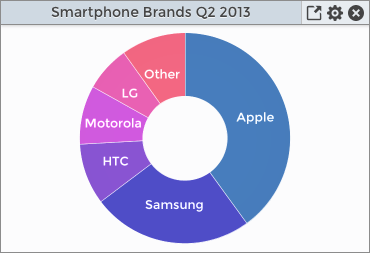
Pie Charts
The simplest dataset format is used by pie charts and ring charts, which extend a basic pie chart. Because they extend a pie chart, they offer all of the same methods and capabilities of a pie chart, and have a few extra methods and capabilities that are specific to the ring chart format. The data for these charts will be in the format of:
BBjString key, BBjNumber value
For example, the dataset for a pie chart might look like:
|
Apple |
40.0 |
|
Samsung |
24.7 |
|
HTC |
9.4 |
Which would then result in a chart like the this:
Bar Charts
There are three types of bar charts: bar charts, stacked bar charts, and stacked percentage bar charts. The stacked bar charts and stacked percentage bar charts both extend the regular bar chart widget. The datasets for bar charts are more complex than pie charts and are referred to as category datasets. The data for these charts will be in the format of:
BBjString rowKey, BBjString columnKey, BBjNumber value
The bar chart’s display will vary depending on whether the supplied rowKey is unique or not. Here are two different examples:
|
Percentage |
North |
78 |
|
Percentage |
East |
60 |
|
Percentage |
South |
44 |
In this example, the rowKey is not unique which essentially results in a single set of data to display. The resultant stacked percentage bar chart looks like this:
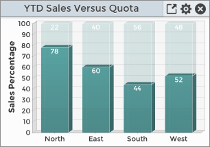
Note that the data columns of rowKey, colKey, value correspond to the chart’s legend, domain axis, and range axis. The chart above does not show a legend, as we specified that it should not display the legend when we created the widget. If the legend were turned on, it would consist of the single, non-unique rowKey of Percentage. Since that adds no value and does not further describe the data, it is best to turn off the legend to make more room for the plot.
By making the rowKey data unique, we can introduce another dimension to the data. Here is an example of a dataset that provides unique row and column key entries:
|
Bachelors |
2010 |
2003 |
|
Bachelors |
2011 |
1350 |
|
Bachelors |
2012 |
2408 |
|
Masters |
2010 |
985 |
|
Masters |
2011 |
1300 |
|
Masters |
2012 |
1634 |
This dataset results in a chart that looks like this:
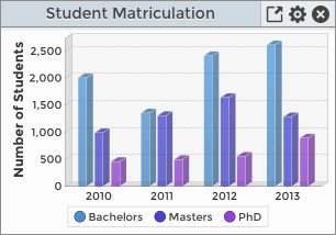
Now that we have differing rowKeys that further describe the data, we have turned on the chart’s legend. The legend item keys represent different groups of data in the chart, and their colors match the bars in the chart for the corresponding rowKey.
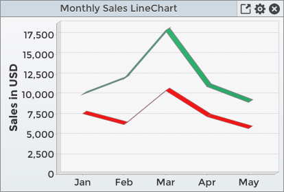
Line and Area Charts
These two charts use a similar dataset format:
BBjString series, BBjString key, BBjNumber value
The number of lines on the chart is determined by the number of unique values in the series column of the dataset. For example, if all rows in the dataset contain the same value for the series column, then the chart will be comprised of a single line. In this case, all of the rows in the dataset correspond to data points on the line where the key determines the position on the domain axis and the value determines the position on the range axis. If the dataset contained two unique values for the series column, then the chart would be comprised of two lines.
An example dataset with two series might look like:
|
Sales |
Jan |
10000 |
|
Sales |
Feb |
12000 |
|
Sales |
Mar |
18000 |
|
Expenses |
Jan |
11000 |
|
Expenses |
Feb |
9000 |
|
Expenses |
Mar |
7580 |
Resulting in a chart with two lines like this:
XY Charts
XY charts use a simple dataset that is comprised of two numeric values that correspond to the X and Y values on the chart. The dataset format looks like this:
BBjNumber xValue, BBjNumber yValue
An example dataset might look like:
|
0 |
32.25 |
|
1 |
53.98 |
|
2 |
107.54 |
XY charts are flexible in that you can add multiple series to the chart, either by calling methods on the chart or using SQL queries. Each series must have a unique name, and if the chart was created with the constructor that included an SQL query string then the first series will take the name of the chart for its value. It is also possible to create the chart without specifying an SQL query, then adding multiple series to the chart via SQL statements. Here is such an example:
sql2$= "select top 10 num(cust_num)-1, 40*RAND()+125 from customer where num(cust_num) < 41 and sales_ytd > 0 "
xyChart!.fill("Income", connectString$, sql2$)
sql3$= "select top 10 num(cust_num)-1, sales_ytd/2+30 from customer where num(cust_num) < 41 and sales_ytd > 0"
xyChart!.fill("Sales", connectString$, sql$)
The code executes the fill() method on the chart widget, specifying the resultant series name, the database connection, and the SQL query. The datasets will be added to the chart and will ultimately be rendered in reverse order. I.E. the last series added to the chart will be the first series rendered. The rendering order comes into play with the series overlap each other. Additionally, it is possible to configure each series separately, specifying parameters that indicate whether or not to draw the lines and shapes, whether the lines should be smoothed or discrete, the width of the line, the datapoint shape, etc. If the series has been configured to use smooth lines, it’s possible to set the fill color underneath the line - similar to an area chart. This color may include an opacity value so that other lines and shapes beneath it are still visible. This is another example of where rendering order impacts the final look of the chart.
An example of such a chart looks like this:
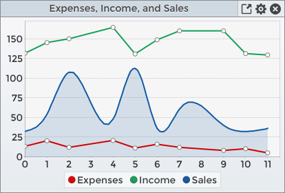
Note that three series have been added to the chart, and the Sales series has been customized to remove the default data point shapes. It has also been smoothed out and filled down to the domain axis with a lighter version of the line color. Because it was specified last in the list of series added to the chart, it was rendered first. This means that the red Expenses series is drawn on top of the blue filled area of the Sales series, instead of below it. If it had been drawn below the blue fill, it would have appeared purple instead of red as the translucent blue fill would have been mixed with the red line.
Even though the dataset requires numerical values for the X, or domain, axis it is possible to provide an alternate set of labels that corresponds to the X values in the dataset. For example, to change the domain labels from the month number of 1, 2, 3, etc. to the month name we could execute this method on the chart widget:
myChart!.setDomainAxisLables("My Domain Title", "Jan,Feb,Mar,Apr,May,Jun")
The setDomainAxisLables() method takes two strings. The first string is replacement title for the domain axis, which may be an empty string indicating that the domain title should not be included on the chart. The second string is a comma-delimited list of replacement values for the X values in the dataset. The chart will only plot values for the data points that correspond to the supplied replacement labels. So if the number of replacement labels is less than the number of X values then the chart will effectively be truncated to the first <numReplacementLabels> values. If the number of replacement labels exceeds the number of X values, then the labels will be included on the chart but the right side of the chart will be empty as there will not be any X/Y data points associated with those labels.